
Note: Images can only be uploaded by goUrban. Please provide the respective picture in a high resolution format or vector format. After uploading a new image or logo the app has to be released as well. Therefore, the splash screen can only be updated when a new app is being released every 4 weeks. A new picture needs to be sent to goUrban at least 5 business days prior to the app release.
General
Dark mode
When toggled on, the dark mode is activated. When activated the colors below can be adjusted again for the dark mode.
Note: dark mode will be turned on in the app regardless of the phone settings when activated via the dashboard.
Colors
The colors are used throughout the app in different parts. It is possible to change:
- Primary color: buttons on map and menu items.
- Active color: progress bars, action buttons, linings.
- Button active color: Different buttons in the app.
- Success color: Pop-outs.
- Danger color: Pop-outs.
- Background color: Any background that is shown. Important for images that have a transparent background.
Show currency code instead of symbol
When toggled on, the symbol is not shown but the currency code. ISO 4217 is being used.
Splash screen
Image
Select from the dropdown one of the uploaded images.
Type
Select from the dropdown one of the uploaded images.
Background color
The background color is hard coded and has to be changed by goUrban. An app release is necessary to change it.
Log in screen
Show welcome text
When toggled on, the welcome text will be shown in the app. The text can be modified via Localization using the translation key “Profile.welcomeTo”.
Welcome image
Select from the dropdown one of the uploaded images.
Fields
There are three options for the fields:
- visible fields
- these fields are displayed in the profile section of the end-user app
- required fields
- these fields will be prompted during sign-up and have to be filled by the customer
- editable fields
- these fields can later be changed in the profile section of the end-user app
If one of the buttons is toggled it will be visible/activated in the white-labeled end-user app.
The possible fields are:
- First name
- Last name
- Phone number
- Birth date
- Address
- Postcode
- City
- Country
The names and descriptions of the fields can be translated via Localization using the translation key e.g.: “Profile.firstName”.
Vehicle info
Vehicle display name
Select from the dropdown how the name of the vehicle will be displayed in the app. There are five options:
- Code (meant is the QR-code name)
- Name
- License plate
- Type (can be found in Vehicle Category Details)
- Name and license plate
The name, code, and license plate of a vehicle can be changed in the vehicle quick-view. You can find more information in Vehicles quick-view.
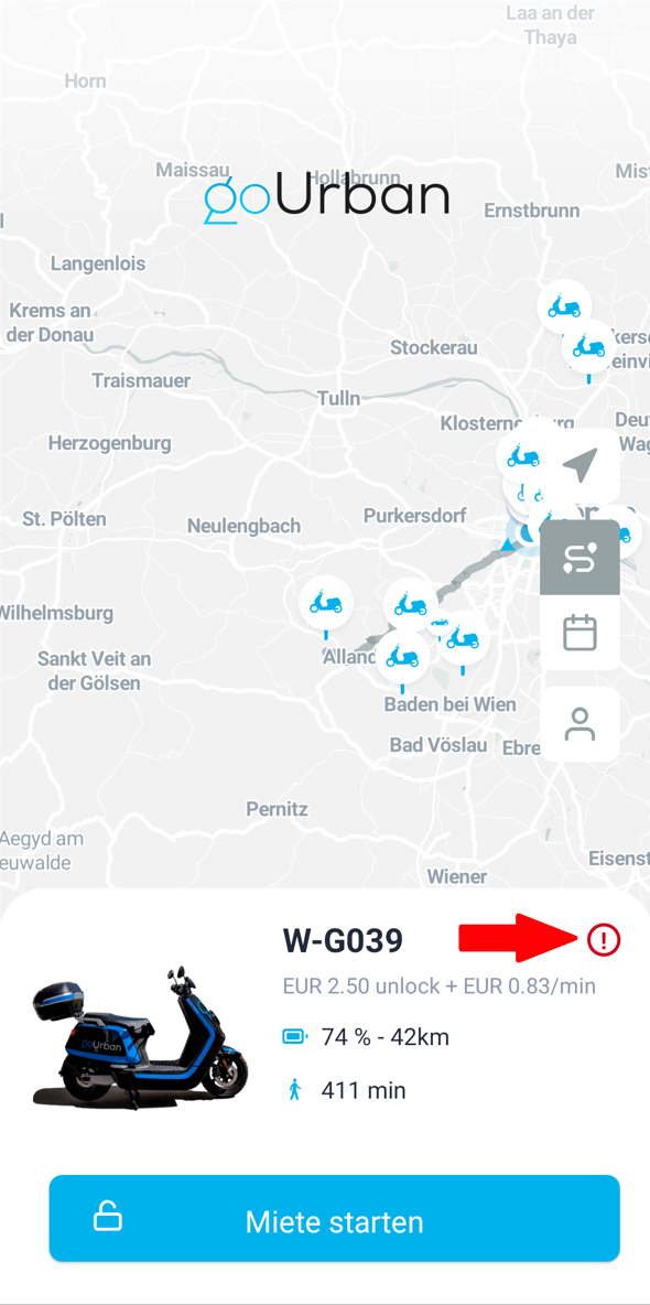
Show damage report button
If toggled on, the button will appear in the app when selecting a vehicle. See the picture below for reference.
Bookings
Show price with VAT
If the button is toggled on, the booking price with or without VAT will be displayed during the selection process of the booking. See the picture below for reference.

Number of days to be displayed
You can set the number of days to choose in the scroll menu during the selection of the booking date. See the picture below for reference.

Slot in
Select from the dropdown if the slots shall be booked in:
- minutes
- hours
- days
Booking slots (comma separated)
Set as many booking slots as you like and separate them with a comma and do not use a space between them.
Custom booking slots
It is possible to enable custom booking slots. If enabled, the customer can select a custom start and end time for the booking.


NOTE:
To read more about the bookable branches or branches in general please review the Types of branches article in our knowledge base.
Map
Show logo on top
If toggled on, the logo with a transparent background will be shown on top of the screen in the map view of the app.
Show QR code button
The QR code button is visible only when the free-floating mode is selected. You can choose if this button shall be displayed or not.
Default zoom level
The default zoom level of the app can be adjusted here. Please enter a number between 0 and 25.
Coordinates
Define the default coordinates, of the map when a user is opening the app. The coordinates can be changed per branch in order that users will be centered on their home branch.
If you want to have different coordinates for every branch, this has to be changed in the branch quick-view under the Details tab. Once you click on the coordinates a pop-up will show that will allow you to edit the location.
Direction type
It is possible to select different time frames and routes of the following:
- driving-traffic
- driving
- walking
- cycling
The calculation and metrics behind this feature can be found here: https://docs.mapbox.com/help/getting-started/directions/.
Map style
The map style URL is shown here. The style of the map can be changed. Before doing so, copy the link and save it in another file. Changing the map link to the wrong one can cause a failure in loading the map, which results in not being able to start or end rentals for ALL users.
You can read more on how to make this change HERE.
Show cluster numbers
The number of vehicles in a branch can be summed, clustered, and displayed in the app.
Note: It is recommended, to either use the branch images or the cluster numbers.
Use branch images instead of logo
You can upload every branch with its own logo.
When toggled on, the image you uploaded in the branch quick-view will display instead of the logo.
Vehicle dot color
The default vehicle dot color can be selected here dynamically. If you want to have different colors for every vehicle category, please navigate to the vehicle categories quick-view under the App tab.
Area colors and opacity
The colors and opacity levels are the default settings. If you want to have different colors and opacity for every branch, this has to be changed in the branch quick-view under the App tab.
Dynamically change the color of areas in the app by clicking on the color. You can also enter a specific color code that fits your corporate identity.
The areas are:
- Business area
- Restricted area
- Prohibited area
- Discount area
Change the opacity of the area colors by entering a value between zero and 1. Separate with a dot e.g. “0.2”.
- Opacity business area
- Opacity restricted area
- Opacity prohibited area
- Opacity discount area
Screens
You can change the colors of different modals and further customize your app. Please note that if nothing has been chosen, the default color will be selected.
Note: It is not possible to delete a color. Therefore, you will have to select the same color as the default color, if you want to rewind your settings.
Sharing modal

Packages memberships

Wallet

Balance history
